A game usability review of Maze King

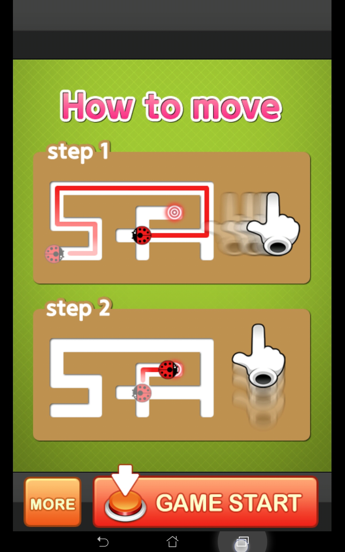
Maze king is a maze game in which the player needs to get a ladybug out of a maze, but telling it in which direction to move at each cross roads. To chose a direction, the player simply has to swipe up, down, left or right, and the ladybug will automatically move as far as possible, until the next crossroad.
Tested on Android / Asus Transformer Tab

On start-up, the splash-screen of the game is the tutorial. This is a good start, but soon, the player arrives on the level selection.
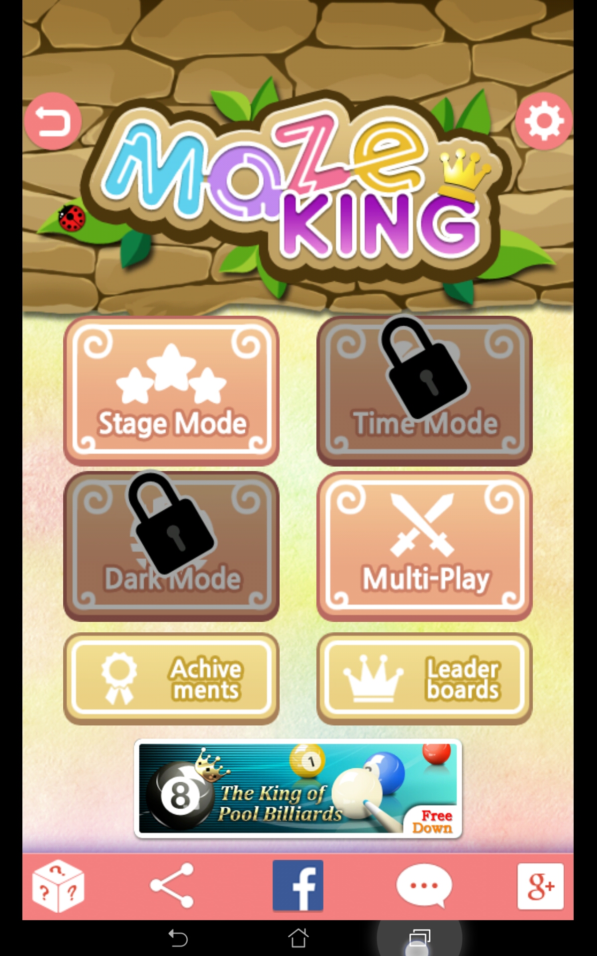
He is presented many choices, some of which are disabled, and one of them not being accessible immediately without registering an account.
This can confuse the player a little at first, wondering where to start on this cluttered screen. Additionally, it can frustrate the player to chose the one thing that he can’t do easily: the multilayer.

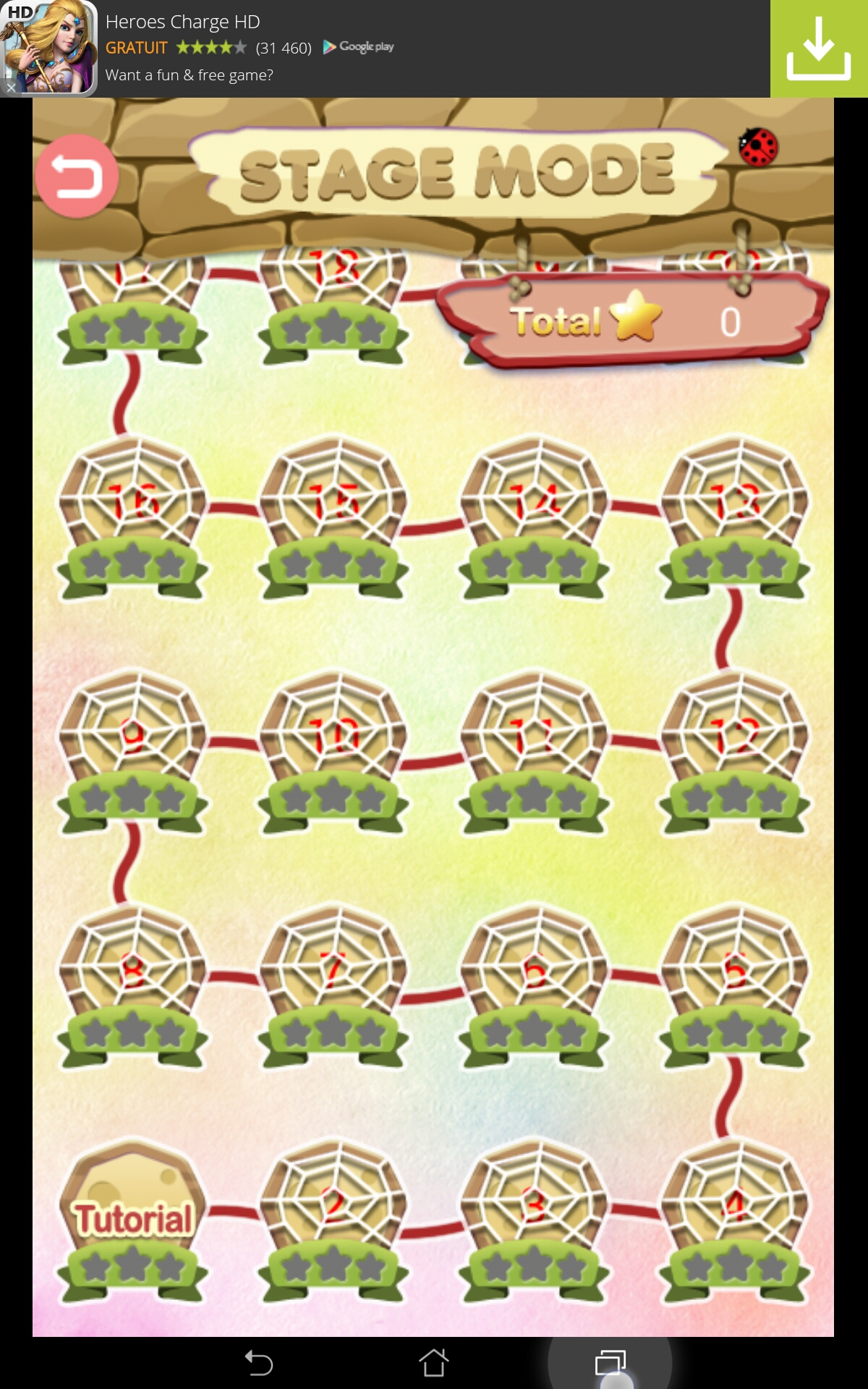
Once the player has chosen the one best choice on this first screen, he is again shown a screen with many choices, out of which only one is active: the levels. He can only run the tutorial at first anyway.
Since the player doesn’t really have a choice at this point – or his choices may lead him to have a negative experience of the game, it is usually better to get him directly to the one thing he can do.
This means the game could skip both menus, and directly get him to the first tutorial level. The player can learn about the menus by himself later, when he is convinced the game is fun to play, and he has gotten a good impression from the first levels.
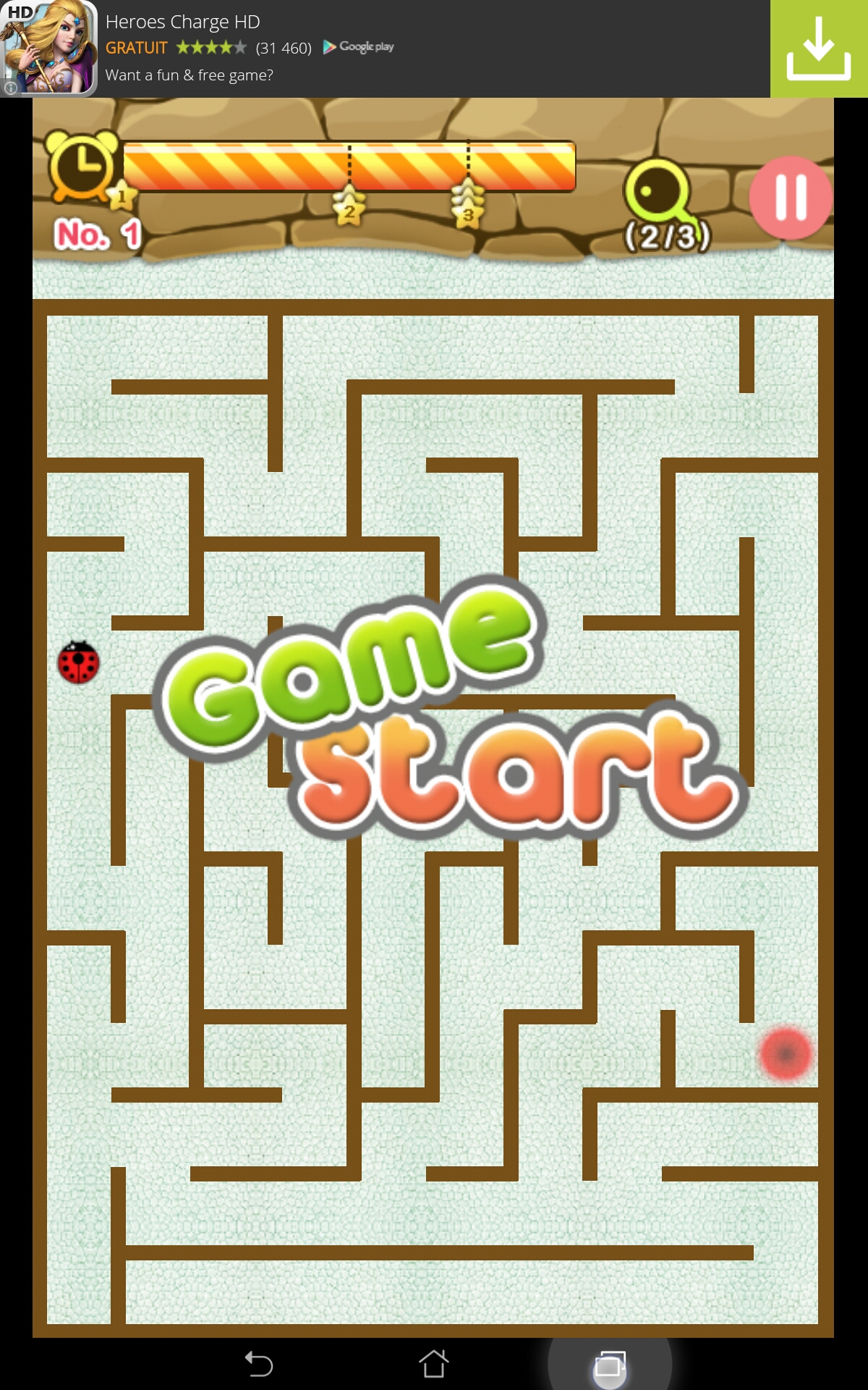
The first tutorial level is a regular maze. It is the tutorial because during the whole play, the game tells the player which move to make to progress.

This is nice because it shows the player how to swipe and makes sure he knows how to move before letting him do what he wants. It is a bit intrusive though, because the player will feel like he is smart enough to decide which way he has to go.
It might be better if the game only forced the two first moves on the player, and helped him only if he was stuck afterwards. This would be more satisfying for the player who gets it and already knows the gestures, since the principle is quite simple.
The fact the tutorial doesn’t use any text is nice, and makes the game quite accessible even for younger players.
Once the first level is completed, the player can quickly move from one level to the other without necessarily going through the whole menu every time, which creates a seamless and fluid experience.
The game also adapts well to the mobile context thanks to a good management of interruptions in the game.
Articles on similar topics
The Mass Effect series
Game Usability reviews, Game user experience analysis,
A game usability review of Triple town
Game Usability reviews, Mobile game user experience,
A game usability review of Amazing Brick
Game Usability reviews, Mobile usability, Mobile game user experience, Game user experience analysis, Initial experience, Out of box experience,
A game usability review of Auralux
Game Usability reviews, Mobile usability, Game user experience analysis, Initial experience, Out of box experience,
A game usability review of Ollie Pop Retro Skateboarding
Game Usability reviews, Game user experience analysis, Mobile usability, Mobile game user experience, Initial experience, Out of box experience,
A game usability review of Time of Exploration
Game Usability reviews, Game user experience analysis, Mobile usability, Mobile game user experience, Initial experience, Out of box experience,