A game usability review of Perditus – a rythm game
Perditus is a rhythm game in which the player has to tap specific parts of his screen in order to complete levels and get the highest score possible.
Tested on Android / Samsung galaxy S3
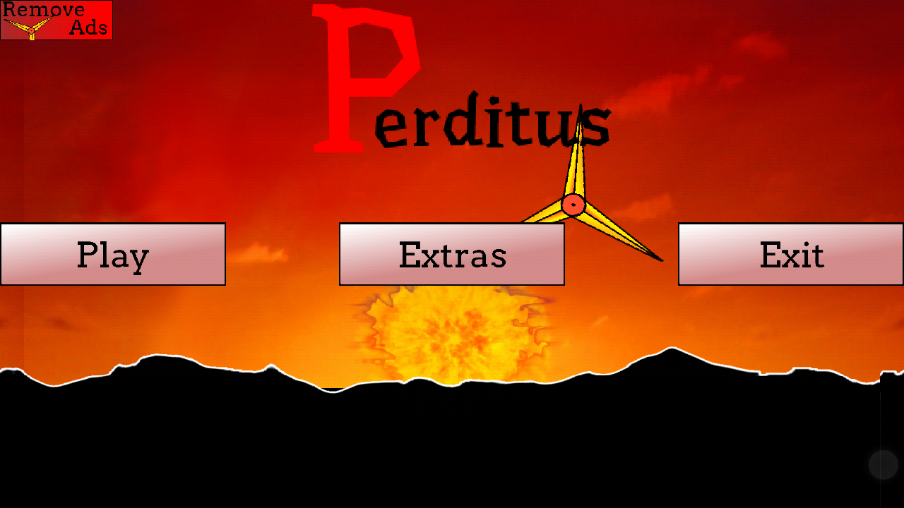
The game starts up really fast, buy the first interface has several usability issues which fail to create a positive first impression. The first impression will impact all the following judgements the player will make on the game, so it is really important to get that right. If the first impression was positive, he will see other attributes of the game more positively. If on the contrary the first impression is negative, the player will be more critical of other features he will discover later on.
In the case of Perditus, the menu design is clumsy and difficult to read. Some text is written in blue on red, which creates a nasty visual effect in the human’s eye. Because of how human vision works, this can create a flickering impression and unpleasant effects.
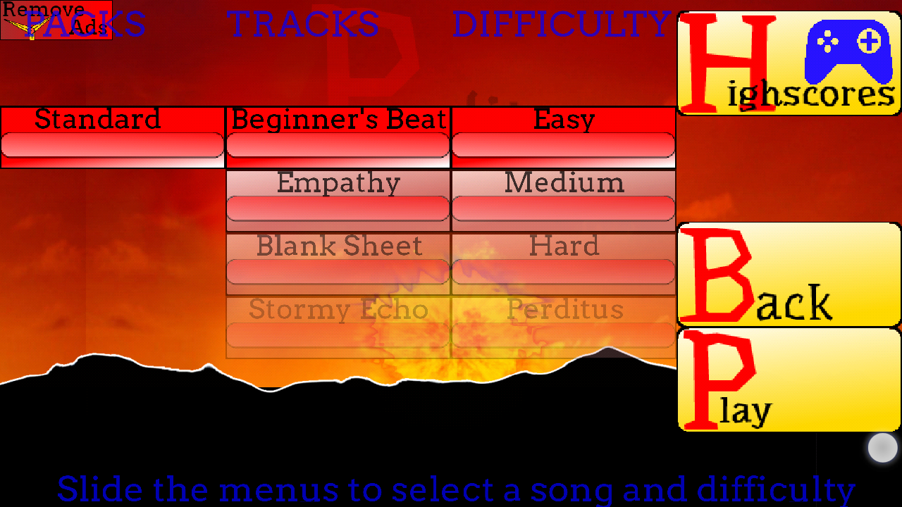
The level selection in particular is too complex. The player is presented with several levels of decisions he needs to make all at once, with no sense of order. The first entry reading “standard” is not even a choice at this point, so it could be hidden at first.
Next, the player has to chose a song track and a difficulty level. This offers the player a lot of choice and can be confusing as to what this all means, since the columns don’t have a title identifying the available choices or helping the player to anticipate their impact. This also clutters the screen, making the “play button” less visible.
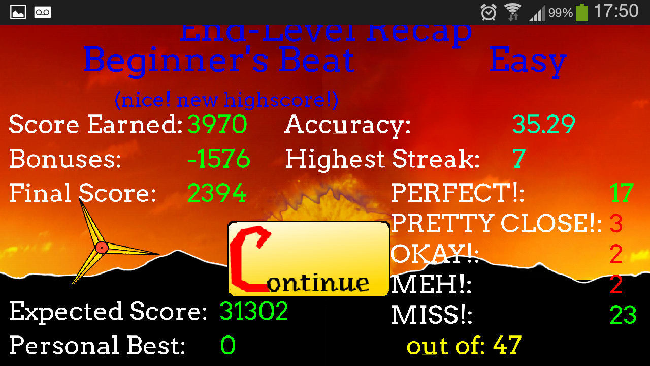
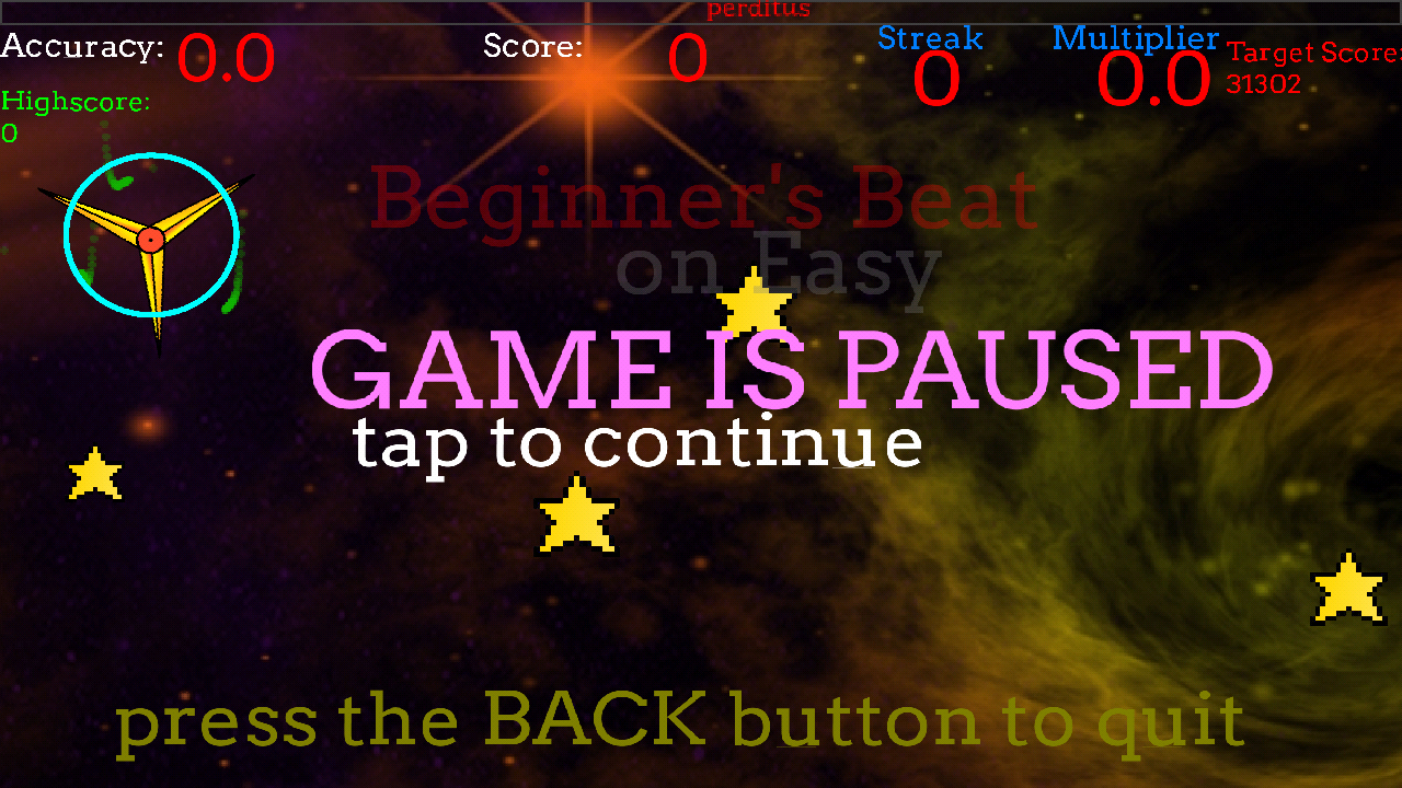
The menus after the game is finished are also too cluttered with a lot of information. Distinguishing different types of information and presenting them in a more visual way would be more understandable and would help guide the user’s attention to what he’s interested in most.
Once the game has been launched, the experience becomes a lot better though – if the players reach this point.
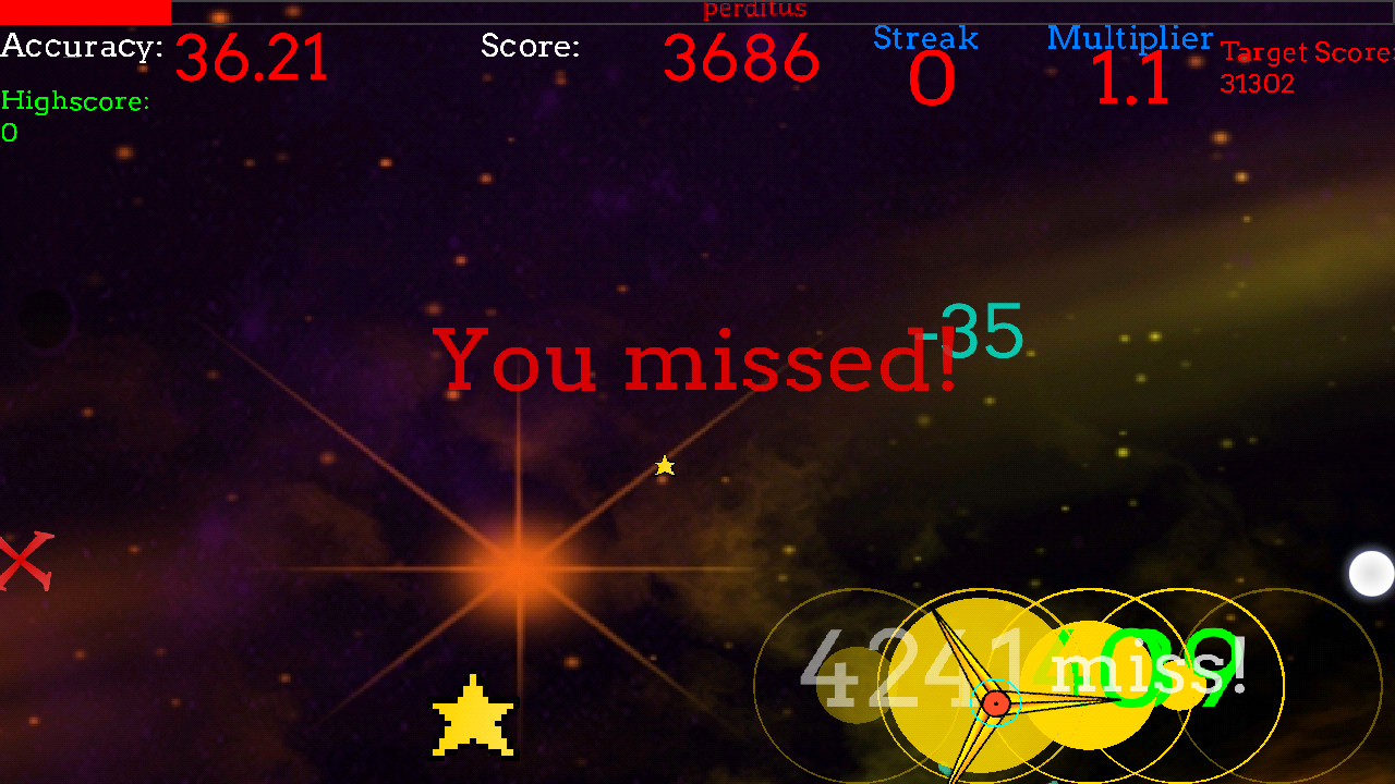
The areas that need to be tapped and the tempo in which the actions should be done is very explicit, using both clear visual and audio cues. Additionally, a moving cursor “drops” the targets on the game area, which helps the player visualizing in which order the targets should be tapped.
The targets position takes in account well the constrains of mobile devices. This can be seen when comparing levels of various difficulties. The speed and complexity of patterns increase with difficulty, but the targets are also located in areas of the screen that are more or less accessible when the game becomes difficult, which means harder to reach for the player with his thumbs.
Another issue with the game is that the phone’s back button is sometimes disabled, preventing the player from quickly switching to a different app or pausing the game if they want to use it on the move. In game, the player in encouraged to use it to quit, but once in the menus, it’s not working any more. This lack of consistency is confusing.
Articles on similar topics
The Mass Effect series
Game Usability reviews, Game user experience analysis,
A game usability review of Triple town
Game Usability reviews, Mobile game user experience,
A game usability review of Amazing Brick
Game Usability reviews, Mobile usability, Mobile game user experience, Game user experience analysis, Initial experience, Out of box experience,
A game usability review of Auralux
Game Usability reviews, Mobile usability, Game user experience analysis, Initial experience, Out of box experience,
A game usability review of Ollie Pop Retro Skateboarding
Game Usability reviews, Game user experience analysis, Mobile usability, Mobile game user experience, Initial experience, Out of box experience,
A game usability review of Time of Exploration
Game Usability reviews, Game user experience analysis, Mobile usability, Mobile game user experience, Initial experience, Out of box experience,