A game usability review of Blendoku
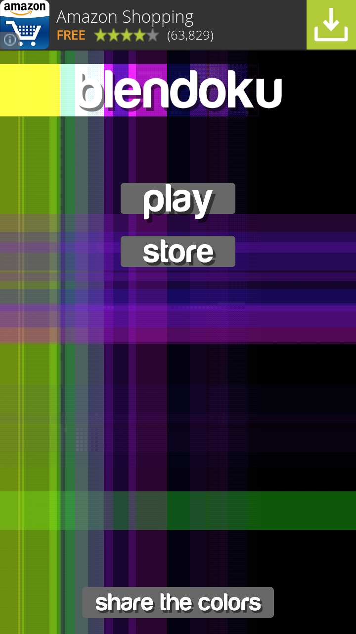
Blendoku is a puzzle game in which the player has to order color gradients in the right order. The goal is very clear and the difficulty is very progressive.
Tested on Android / Samsung Galaxy S3
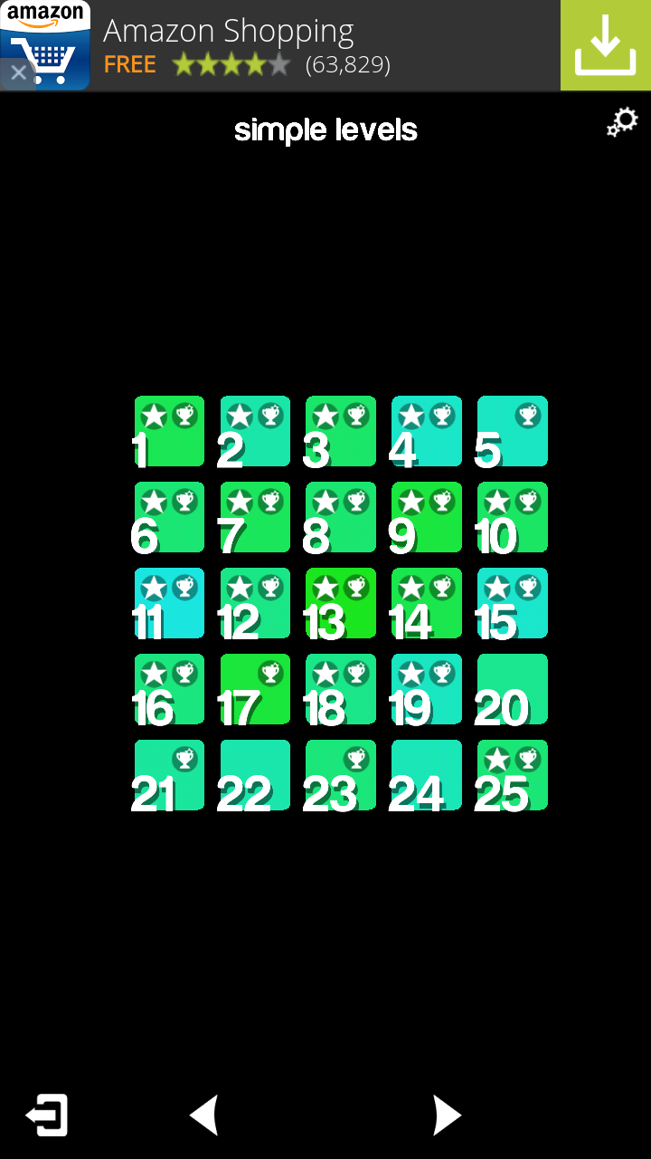
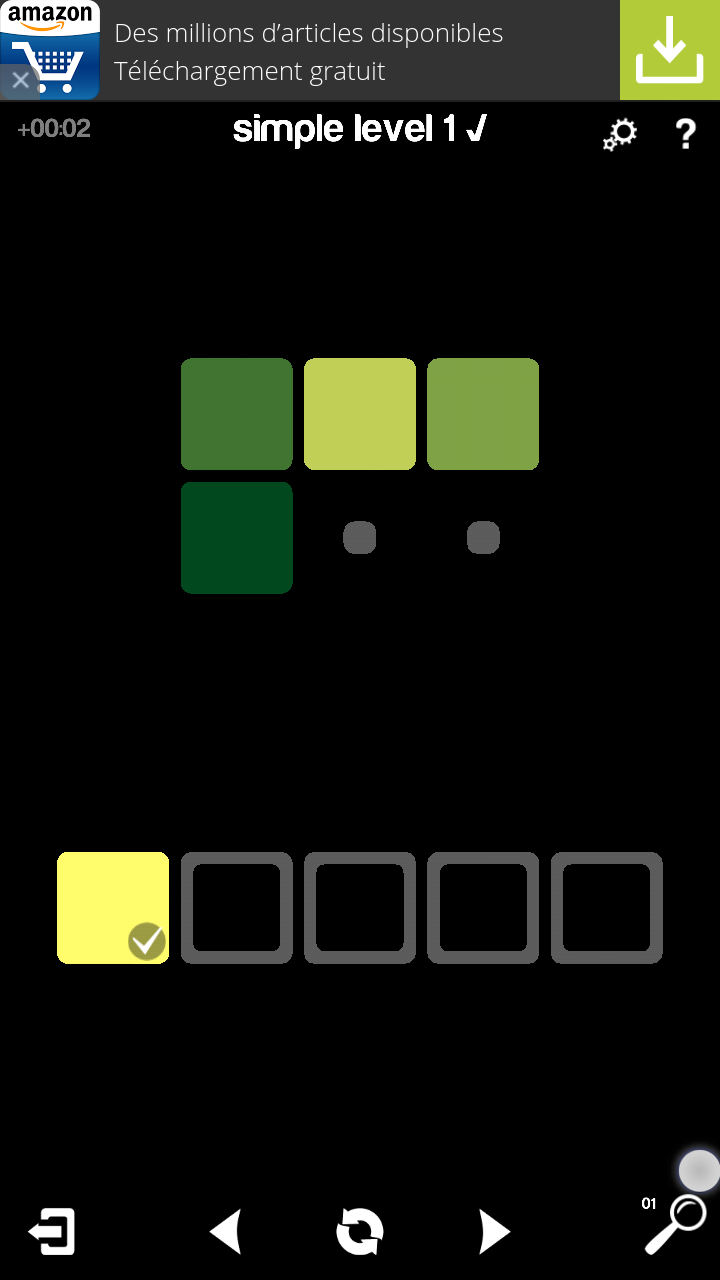
In terms of interaction,the game is very user friendly and adapted to both novice and advanced mobile users. Each action can be performed using buttons: click on next or previous to change screens in the menus. While playing as well, the user can tap a color, then tap the position where it should go. For advanced users, it is possible to navigate faster using a swipe gesture in the menus, and to place colors by draging the color to the right position.
When the user solves more complex puzzles, he can want to start over completely if he feels stuck. A reset button allows to do this very fast and contributes to the games good usability.
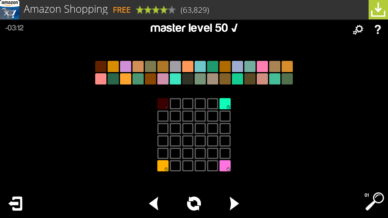
The harder levels have a lot of colors to sort, and the interactive areas are very small, which can lead to interaction errors. Tilting the device into landscape mode can help for some of the levels to display bigger areas, but generally the master levels are not very usable on mobile.
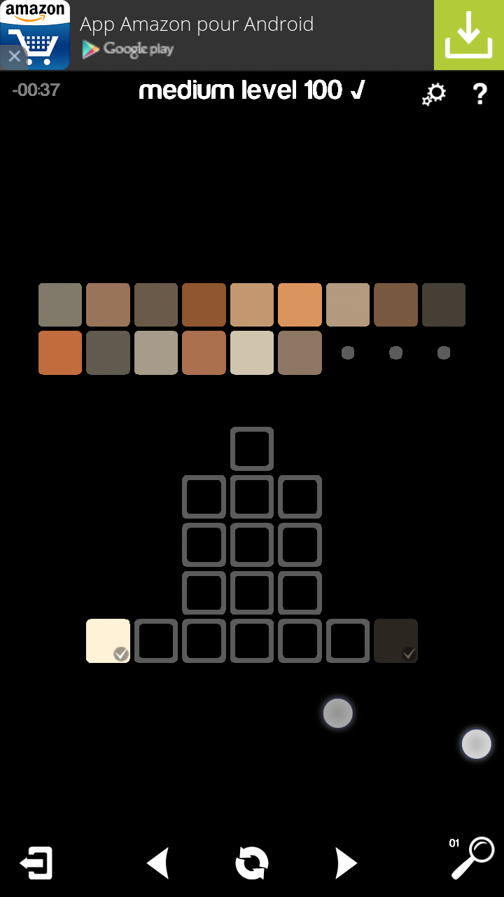
A warning message actually tells the player they are more adapted to tablets then mobile, but the user still has the freedom to continue with his phone anyway. This is good, so the user is warned, but still has control over what he wants to do. The game could however propose a zooming feature to make this more user friendly also on mobile.
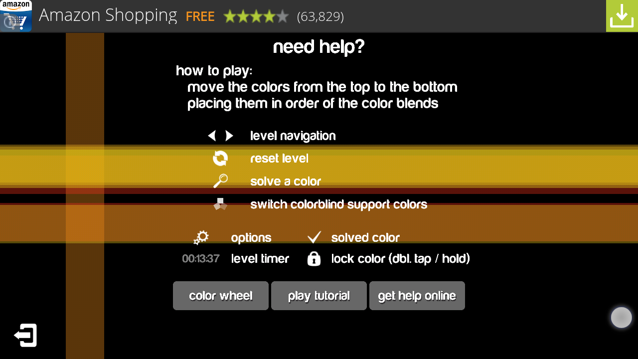
The game proposes a hint feature once a day. This allows to solve one of the colors and lock it in the right position. This is a nice incentive to prompt the user to play again daily, and to come back the next day when he is stuck on a level to have a better shot at it with the hint.
In game, the interface presents two buttons: a question mark and a magnifying glass. At first, this can be confusing to the player: both icons could be used for help. Actually the question mark displays a how to play screen, while the magnifying glass allows the user to ask for a hint once a day. This is not very clear from the start.
Adds are placed on the top of the screen in this game, which is nice to the player. Although the top of the screen is one of the most visible, it is less accessible and avoids tapping on the adds regularly by accident. It is less intrusive and players interested in the add can still tap it quite easily, but only if they want to.
Articles on similar topics
The Mass Effect series
Game Usability reviews, Game user experience analysis,
A game usability review of Triple town
Game Usability reviews, Mobile game user experience,
A game usability review of Amazing Brick
Game Usability reviews, Mobile usability, Mobile game user experience, Game user experience analysis, Initial experience, Out of box experience,
A game usability review of Auralux
Game Usability reviews, Mobile usability, Game user experience analysis, Initial experience, Out of box experience,
A game usability review of Ollie Pop Retro Skateboarding
Game Usability reviews, Game user experience analysis, Mobile usability, Mobile game user experience, Initial experience, Out of box experience,
A game usability review of Time of Exploration
Game Usability reviews, Game user experience analysis, Mobile usability, Mobile game user experience, Initial experience, Out of box experience,