A game usability review of Patakong

Patakong is a rhythm game in which the player is a small banana who has to dance in the rhythm given by a monkey in order not to be eaten. To survive, the player needs to tap the screen with the right timings, which will generate musical sound effects.
Tested on Android / Samsung Galaxy S3
The game starts almost instantly and puts the player directly into the tutorial. This is good because it doesn’t leave the player time to think and quit the game before even trying it.
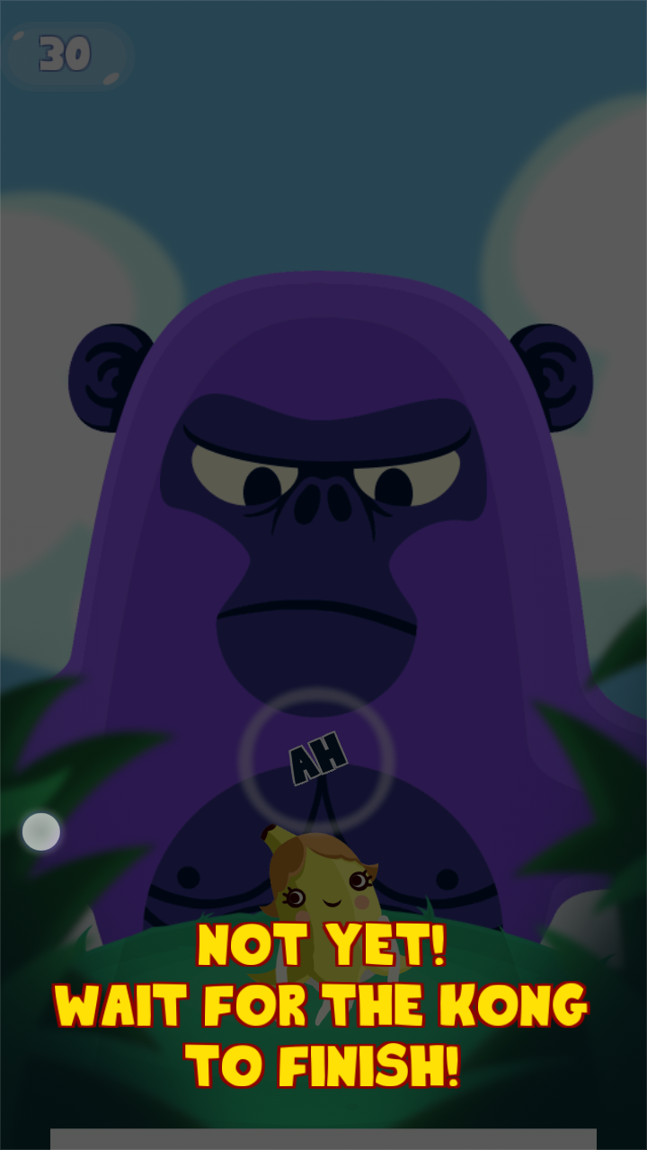
The tutorial however is very long. Whenever the player doesn’t tap once with the right rhythm in the tutorial level, a message will appear in an overlay telling the player if he was too early or too late. The advice messages occur every single time and pause the game. The player then needs to tap the screen to un-pause the game, and play on. This is very disruptive of the game experience, and prevents the player from experimenting with the gameplay mechanics as he would want to. Explanations are good, but they should always be as little intrusive as possible.
From the start, it is not clear if the game will be organised in stages or if it will be an unending session with a leaderboard.
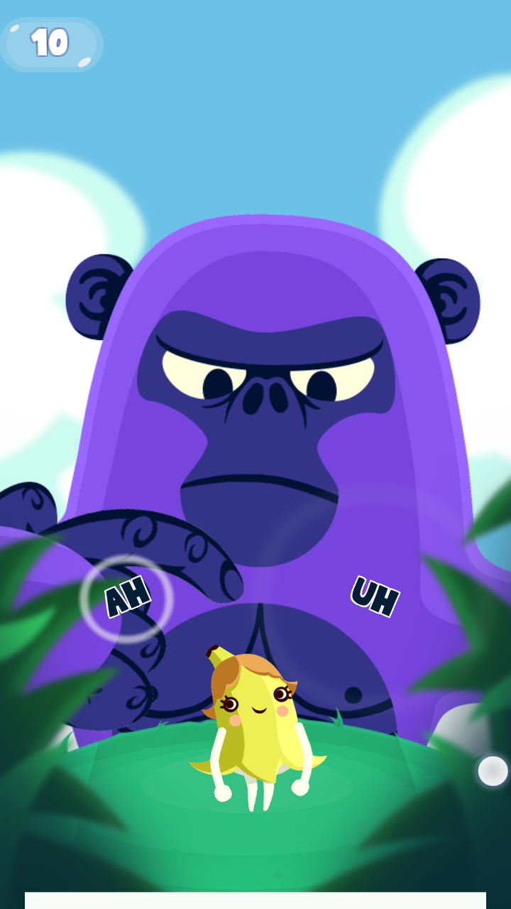
The interaction inputs are very clear however. The timing is indicated both by the sound, a circle which becomes smaller, and a white line expanding at the bottom of the screen. All three indications are both discrete and understandable. Each player can refer to the one he is most at ease with.
At the bottom of the screen, in game, a pause button allows the player to interrupt his play session. Unlike other games which will display a menu directly in the pause screen, this one only proposes to access the title screen or resume the game. When leaving this screen towards the menu, it also asks for a confirmation in a specific dialogue. While confirmations to avoid errors are generally a good thing, in this case it’s a bit overdone.
The player already has to pause the game via a small target once, which might be done by error. He then has to tap a second target, which is also small. Only then the confirmation dialogue appears. This means the player would have to make two accidental inputs in specific zones. Errors are already quite unlikely, this additional step might have been avoided.
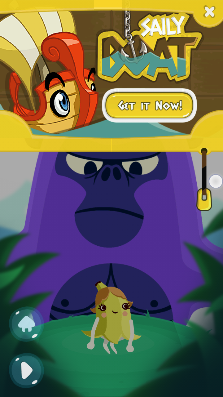
From there, the game also shows a half screen add, which is more prominent than the actual menu items and remains visible until manually hidden. This is a bit confusing to the user who might want to simply leave the game, and will not see the actual menu immediately.
Articles on similar topics
The Mass Effect series
Game Usability reviews, Game user experience analysis,
A game usability review of Triple town
Game Usability reviews, Mobile game user experience,
A game usability review of Amazing Brick
Game Usability reviews, Mobile usability, Mobile game user experience, Game user experience analysis, Initial experience, Out of box experience,
A game usability review of Auralux
Game Usability reviews, Mobile usability, Game user experience analysis, Initial experience, Out of box experience,
A game usability review of Ollie Pop Retro Skateboarding
Game Usability reviews, Game user experience analysis, Mobile usability, Mobile game user experience, Initial experience, Out of box experience,
A game usability review of Time of Exploration
Game Usability reviews, Game user experience analysis, Mobile usability, Mobile game user experience, Initial experience, Out of box experience,